Deep dive - Creating Stories in SAP Analytics Cloud
Abstract
SAP Analytics
cloud (SAC) is a cloud-based business intelligence (BI), planning, and
predictive analytics platform developed by SAP. It is positioned by SAP as a
strategic tool for reporting, Analytics, and Planning and widely used by
customers. SAC Stories are most widely used as they provide various options for
visual representations using tables, charts, geo maps, text widgets etc. We
will discuss the details of these story design elements along with the
performance considerations for creating visually impactful yet performance
efficient SAC Stories.
Keywords: SAP Analytics Cloud (SAC), Story, Chart, Cloud, SAP Reporting.
1. Introduction
SAP Analytics
Cloud (SAC) Story is a key feature within SAP Analytics Cloud that allows users
to create interactive and visually compelling reports and dashboards. It serves
as a unified workspace where you can explore, analyze, and share insights using
a combination of data visualizations, narratives, and analytics. It is a
presentation-style document that uses charts, visualizations, text, images, and
pictograms to describe data. Stories can have multiple pages. Many customers
refer to stories as reports or dashboards.

1.1. Modes
SAC offers two
modes of story design, Classic Design and Optimized Design. SAP encourages you
to use Optimized Design Experience mode. It has many usability and performance
improvements and is the prerequisite for future story enhancements like the
integration of analytics design capabilities and digital boardroom features
into the story. Stories created in CLassic mode can be converted to Optimized
Design mode.
1.2. Connections
SAC offers two
main types of connections to integrate with various data sources: Live Data
Connections and Import Data Connections. In Live connection, the data remains
in the source system and is queried in real time. This is helpful for real-time
data access for up-to-date analysis. There is no need for data replication or
periodic updates. However, it can have performance issues for large data
volumes in the stories. On the other hand Import connection imports the data
from the source system to SAC, hence there is a copy of the data created and
storage is required in SAC. In this case data replication or periodic updates
are required to be set up.
1.3. Data Sources
Data for a story
can come from a file, an SAP Analytics Cloud model, data set, or an outside
data source. If you import data from a file or an outside data source, you
create a data set within the story. SAP Analytics Cloud has two types of data
sets, Embedded or private, and Standalone or public.

2. Creating Stories
To create a story,
use the Navigation bar and select the ‘Stories’ button as highlighted in the
picture. Then, choose either a Responsive or Canvas page, or you can select a
template from the available options.

Now we will take a
look at different story elements and what options they provide to enhance the
visualization in the story.
2.1. Tables: Table is a very
basic type of story element to view the data in a tabular format. When you add
a table to a story, a data grid is created with the basic dimensions and
categories of the model aligned along the axes of the grid. It is very similar
to a pivot table in excel sheet. You can change this basic layout using the
following designer tools:
Builder panel to select the
measures and dimensions to include in the rows and columns of your table.
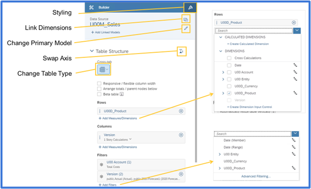
Styling tools to format the presentation.
Here multiple
measures and multiple dimensions can be added to the table. When measures or
dimensions are part of a hierarchy, you can expand them and select their level.
If a dimension has properties associated with it, you can display those in the
table. You can also apply filters to your measures and dimensions. The table
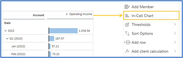
data is updated as per the choices made in the builder. You can display a bar
chart in your table cells so that you have both a visual and a numeric view of
your data. In the table, right-click a column or row header containing a
measure or member of an account dimension, and then select In-Cell Chart.
2.2. Charts
Charts help
display your data graphically. You can pick the type of the chart from the
builder. Then add the measures and dimensions to show in the chart. Once you
have defined the structure of your chart, you can add other chart elements
and/or filters. You can also customize color palettes. Charts can be formatted
to desired appearance like changing background, adding border, adjusting number
format and decimal places, data label and background color etc.

Chart scaling can also be done so that you have a meaningful display of values across multiple charts. By default, charts are not scaled. However, this behavior can lead to incorrect data analysis, if users are not paying attention to the values. You can use chart scaling to ensure that you have a consistent display of values across multiple charts when they display the same measure values.
Multiple Chart
features can be utilized to enhance the visualization of the charts.
·Thresholds can be
used to highlight critical ranges or limits in a dataset. Use color coding to
differentiate between values within or outside the threshold.
·Reference
Lines add context to charts by showing additional data points or key
performance indicators. Add static or dynamic reference lines (e.g., average,
median, or specific target values).
·Variance can be
used to Display variances as absolute values or percentages. It is useful for
comparing actual vs. planned data or year-over-year changes.
·Tooltips provide
additional details when hovering over chart elements. Display dynamic or static
text, including descriptions and underlying data points.
·Linked
Analysis Enable interaction between multiple charts within the same story.
Apply filters from one chart to another dynamically.

2.3. Geo Maps
In SAP Analytics
Cloud, geo maps offer the visualization of data on a world map. You can choose
from a variety of geographical mapping options to display your regional data,
trends, flow, and much more. When you view the geo map in a story, you can use
Zoom in, zoom out, Reset, Zoom to data, Map tool, Polygon filter etc. You can
use map layers and various layer types to define geo maps in your stories. The
following layer types are available:

● Bubble layer: Shows data as
points on the map where you can control the color, opacity, and size of the
bubbles.
●Heat map layer: Uses color to
visualize the data density of the selected measure.
●Choropleth/drill layer: Applies
blocks of shading to different geographical locations.
●Points of interest layer: Points of
interest are sets of geographical data that can be added to a geo map and
analyzed with reference to business data from a model.
●Feature layer: Uses external
data from valid service URLs. This data is layered on top of your existing geo
map to provide additional context.
●Flow layer: Shows the
connection between two locations, such as shipping routes or flight paths.
2.4 Text Widgets: Text widget allows you to add texts to your story which can be static or dynamic. They can be used for a variety of purposes like header data of the story with user details along with the login time and filters information etc.

The hyperlink option for the widget can be used to navigate between pages in the story, to a new story, or to any website. In the text widget, manually type the text you want for the hyperlink, such as Go to Page [X].
2.5. Calculations
Calculation is
always a requirement in any reporting tool. SAC offers various types of
calculations that can be done on the existing measure fields and achieve the
desired key figure values as per the business requirement.
·Calculated
Measure: Perform a mathematical calculation on one or more members of the
measure.
·Restricted
Measure: Restrict the data from a measure so that it includes certain
members of one or more dimensions. For the date dimension, you can pick dynamic
values, such as year-to-date or previous quarter.
·Difference
From: Find the difference in a value between a specific date and time
relative to that date.
·Aggregation: Create
calculations from aggregations such as sum, count, average, etc. You can also
choose what conditions are required for the aggregation to be applied, and when
the conditions are required.
·Date
Difference: Create a calculation that shows the time interval between two
dates, either days, months, or years.
·Dimension
to Measure: Convert a string data format to a numeric format.
·Running
Total: Create a running calculation in a table or chart based on the
dimensions in the widget.
·Currency
Conversion: For models with currency conversion enabled, calculate a value
based on a currency exchange rate.
2.6. Mobile App
The SAP Analytics
Cloud Mobile application is available for iOS and Android mobile devices like
smartphones or tablets. With the SAP Analytics Cloud iOS app, you can log in
with a Touch ID or Face ID. Stories can be shared with a link and when a user
opens a link to stories on a mobile, it automatically launches the SAP
Analytics Cloud mobile app and goes directly to that content. The appearance of
the stories can be defined for different types of mobile devices. Select a
device and size from the Device Preview Bar at the bottom of the story page,
then with a lane in the story selected, open the Builder panel. You can now
define how widgets in the lane will display on a specific mobile device, or
even hide them.

3. Performance Considerations
To create visually
appealing and high-performing SAP Analytics Cloud stories, adhere to best
practices that balance functionality and simplicity. Here are the key
guidelines:
●Story design principles
○Limit pages; create distinct stories for
each use case or audience.
○Use hyperlinks for related stories instead
of adding pages.
○Structure pages by category or type of
information, prioritizing the most-viewed content on the first page.
●Widget and chart guidelines
○Limit widgets per page to six or fewer to
avoid performance issues.
○Avoid charts with more than 500 data
points; use filters to manage data.
○Apply "Top N" features to limit
initial data display.
○Enable background loading for
invisible widgets to improve refresh times. Use the Edit area of the toolbar,
Refresh → Loading Optimization Settings then choose Background Loading from the
drop-down.
●Table best practices
○Limit tables to 500 rows and 60 columns
for readability and performance.
○Use drill limitations for larger tables
and disable "Planning Enabled" if used for analysis only.
●Image optimization
○Use web-sized images under 1MB. Prefer SVG
or PNG formats over JPG for better performance
●Data management
○Minimize linked dimensions in blended
data.
○Reduce the number of data-rich widgets
(e.g., maps, dense charts) to improve load times.
●Hierarchies and input controls
○Collapse large hierarchies or use drill
capabilities to manage dimensions with ALL nodes effectively.
●Performance enhancements
○Use progressive chart rendering for faster
widget display upon reopening.
○Avoid styling rules in large tables to
maintain speed.
○Enable a "High Performance"
power plan on your computer if scrolling in tables is slow.
These practices aim to enhance readability, usability, and system performance while ensuring efficient data visualization and storytelling.
4. Conclusion
SAP Analytics
Cloud (SAC) provides organizations with tools to analyze data, gain insights,
and make data-driven decisions within a single, integrated environment. Stories
are used for creating visual presentation of data and provides a wide variety
of options to format, filter, calculate and present data to cater to different
business needs. Along with the story design options, the performance
consideration aspects and best practices help a developer to create efficient
story designs.
5. References
- https://help.sap.com/docs/SAP_ANALYTICS_CLOUD/00f68c2e08b941f081002fd3691d86a7/2249cc4e678e4f46ace92501320f5ef6.html
- https://community.sap.com/t5/technology-blogs-by-sap/building-user-intuitive-stories-in-sap-analytics-cloud-tips-tricks/ba-p/13486944
- https://help.sap.com/docs/SAP_ANALYTICS_CLOUD/00f68c2e08b941f081002fd3691d86a7/bf77843031e04ce6b6e721e67ccadeaf.html?locale=en-US
- https://community.sap.com/t5/technology-blogs-by-sap/canvas-vs-responsive-layouts-in-sap-analytics-cloud/ba-p/13313353
- https://community.sap.com/t5/technology-blogs-by-sap/10-tips-for-effective-responsive-dashboard-design-using-sap-analytics-cloud/ba-p/13371552
- https://community.sap.com/t5/technology-blogs-by-members/part-1-how-to-create-dynamic-images-in-sap-analytics-cloud-story/ba-p/13429202
- https://www.ibm.com/topics/sap-hana
- https://learning.sap.com/learning-journeys/installing-and-administering-sap-hana
- https://help.sap.com/docs/SAP_ANALYTICS_CLOUD/00f68c2e08b941f081002fd3691d86a7/fbe339efda1241b5a3f46cf17f54cdff.html?locale=en-US
- https://learning.sap.com/learning-journeys/exploring-sap-analytics-cloud